
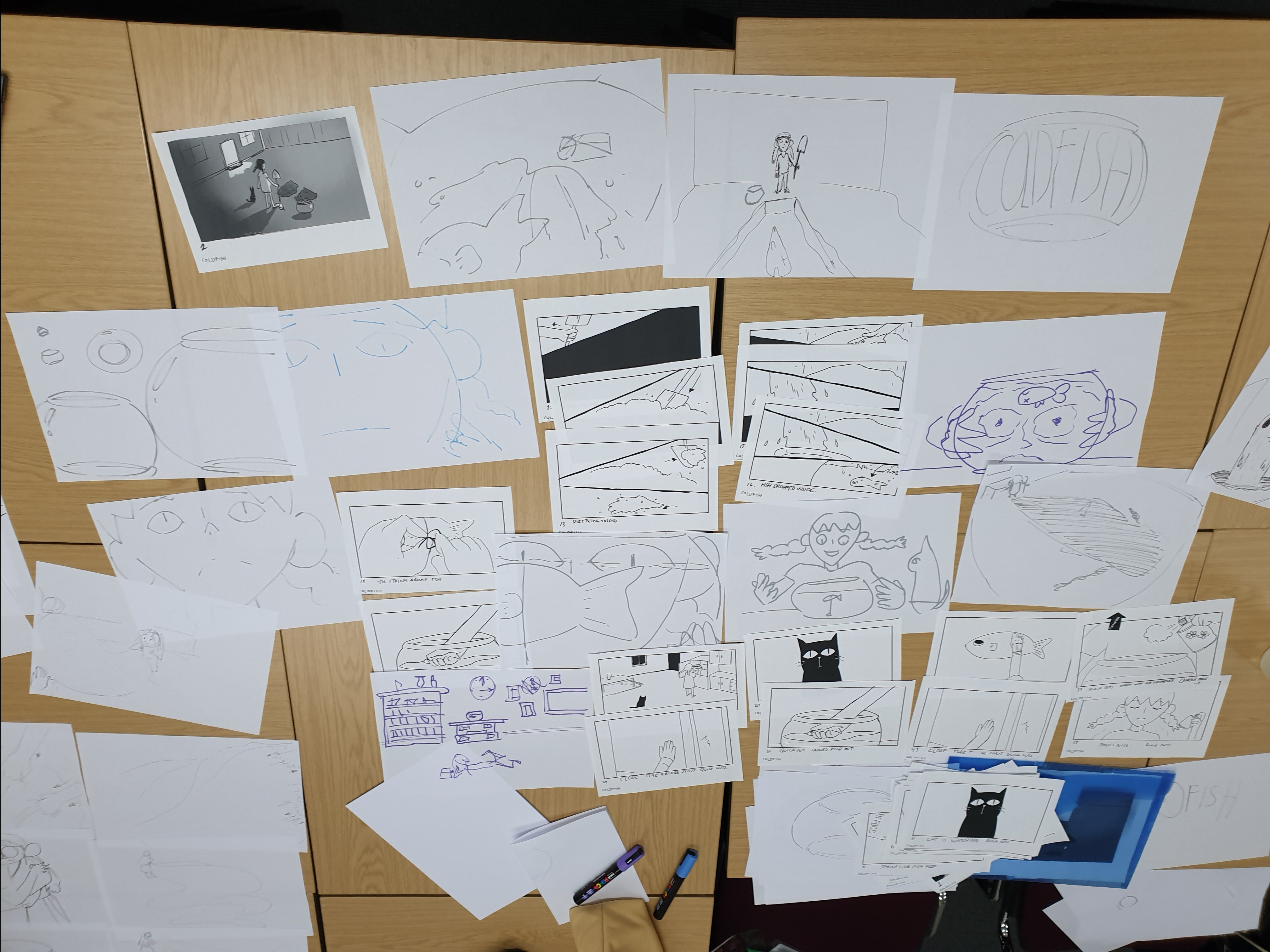
WIP SHOW test
Image
Reply

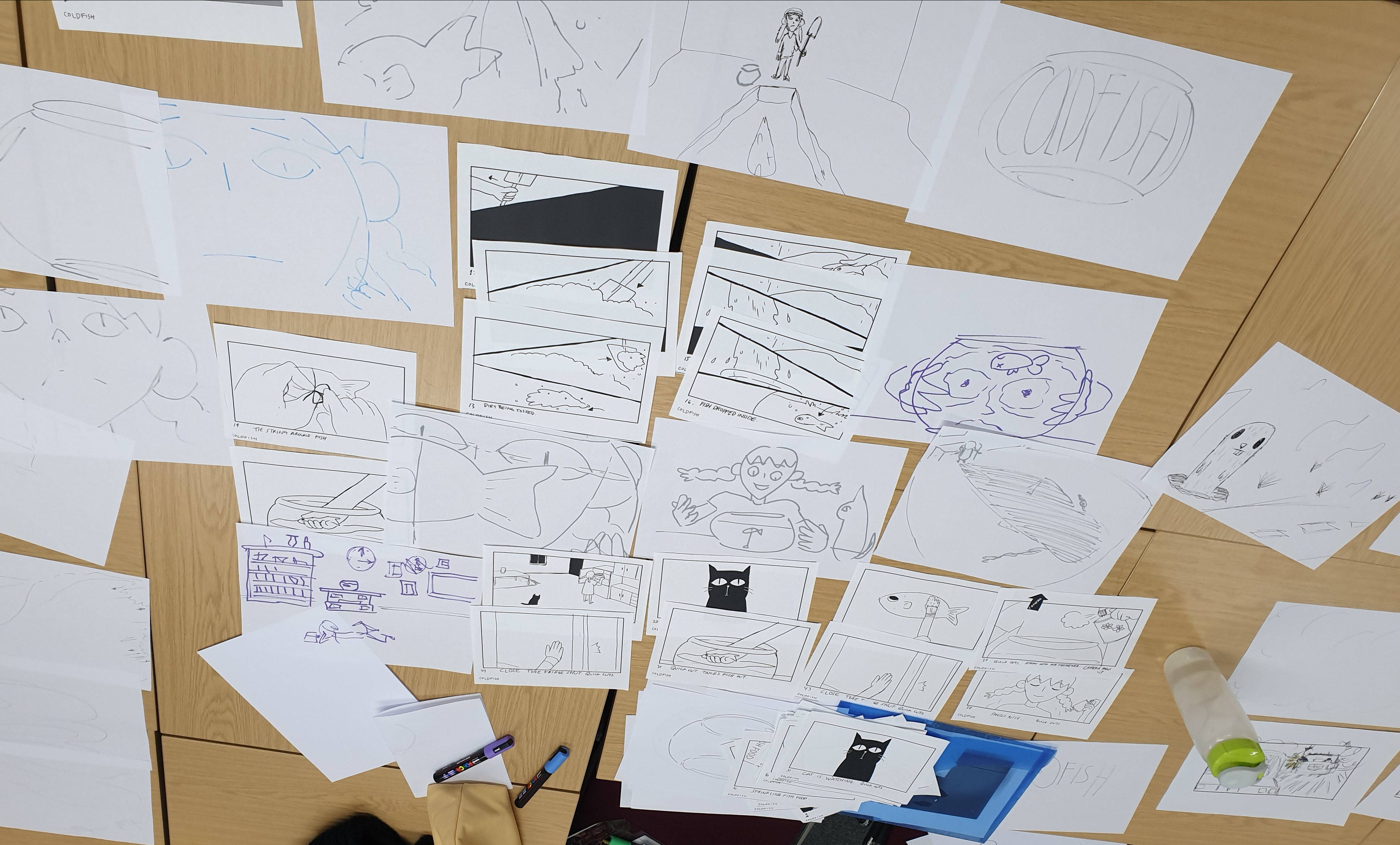
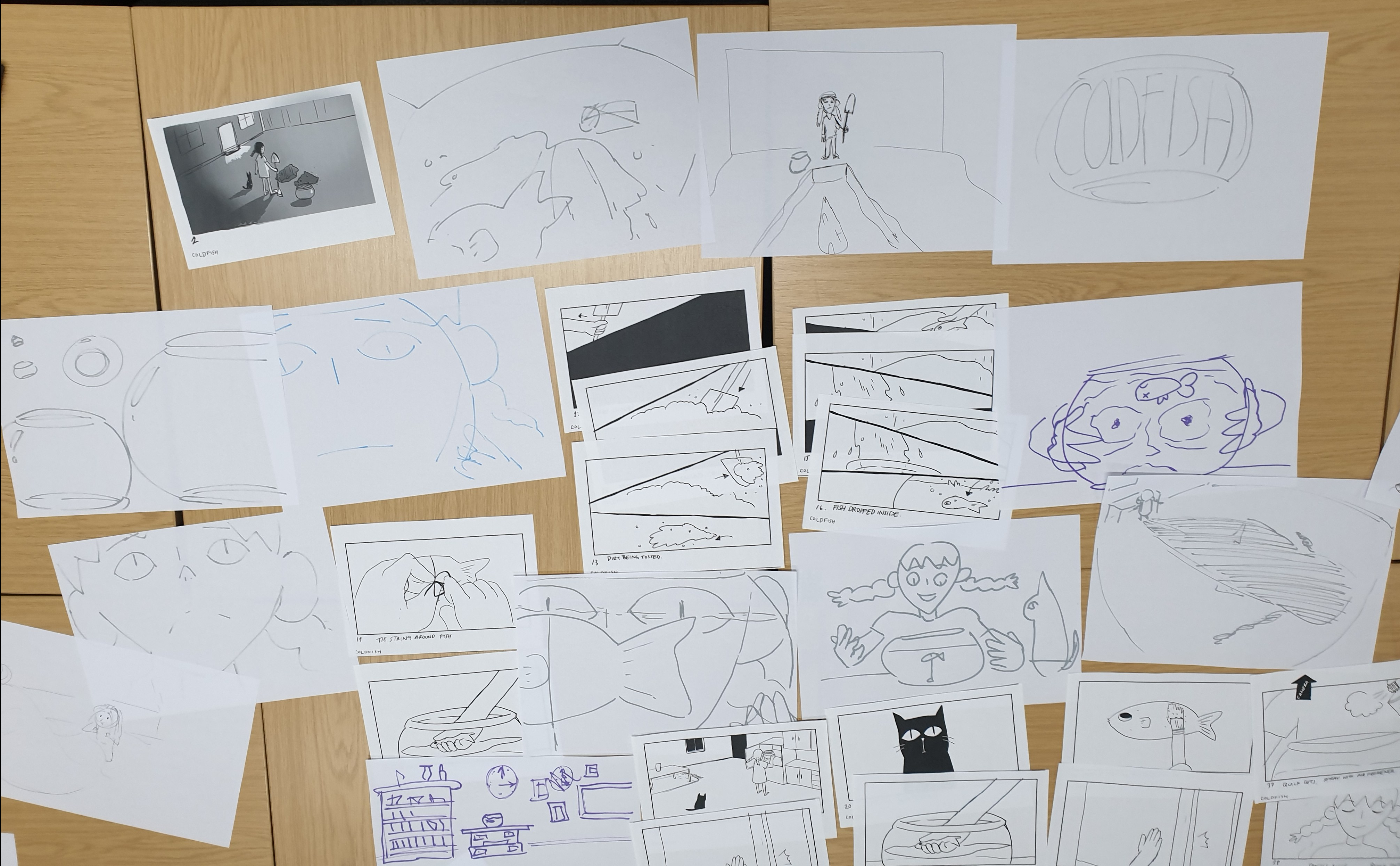
Synopsis:
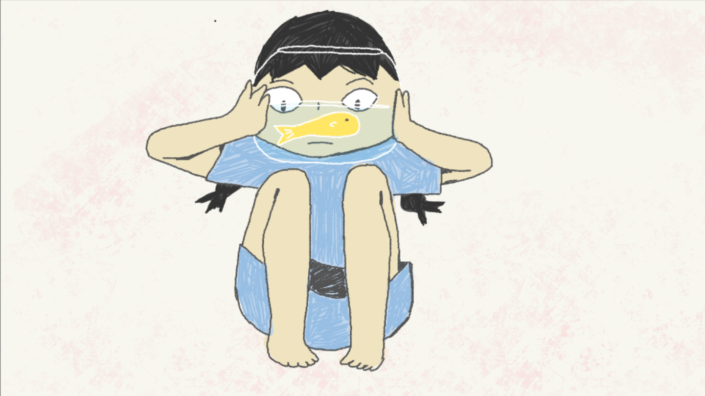
An unrequited love story between a girl and her pet goldfish. A film about the human desire to seek affection–at any cost.
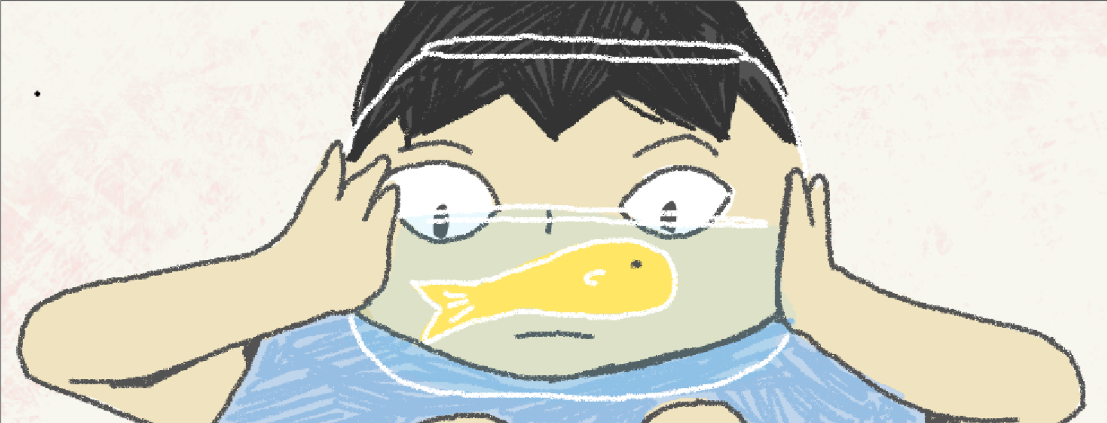
This is the default pencil brush from TVPaint, which was what I initially wanted to use for the final clean up of the film. I tweaked the settings a little bit to give it a more natural-looking texture.

I tried using a TVPaint brush that I had just found online for the dark grey lines. I quite like this brush; it looks much more organic than the default brush I was using (they look like lines from ink pens) and the line weight it a little bit unpredictable, which works because I want the drawings to look a bit more loose.


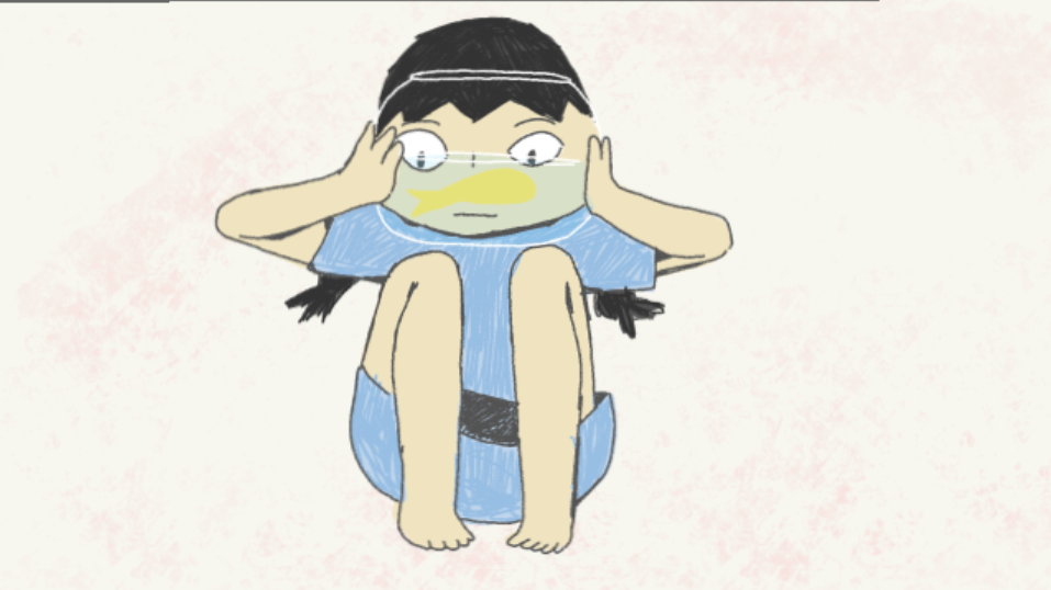
I tried out some different colour combinations for the girl quickly. I tried some less natural-looking colours, but I felt that it did not work as well because the background was so pale, making her look out of place. The natural looking colours work the best out of all of them, but felt still needed some tweaking as well.
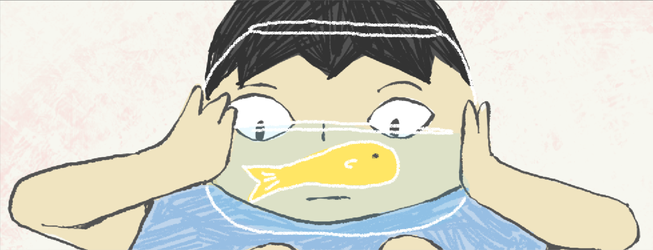
I tried a lineless look, similar to what I did for my minor film. I found that the sharp clean edges against a textural background looks a little off.
I looked at some films such as Tough by Jennifer Zheng and Janet, Who Fell From the Sea by Isabel Greenberg which I know has a lot of textures from graphite and/or charcoal but was coloured in digitally. I don’t think I will be doing this film traditionally, however I would like to emulate some of these textures for a more organic feel.
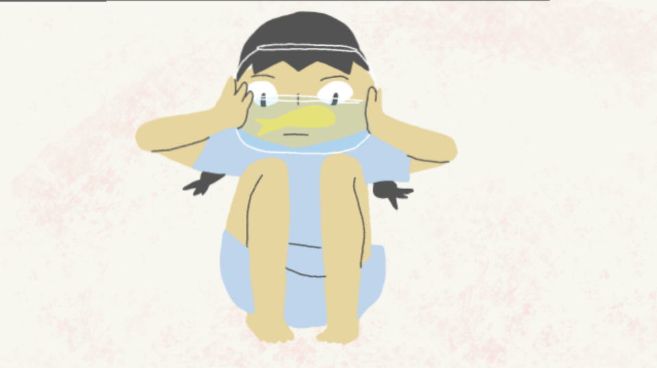
I found that using a textured brush and being a bit less neat works best to make it feel less jarring against the background. In addition to filling areas with flat colors, I also add texture on the hair and dress using the brush. I think this would look great with boiling animation.
These are the images that I brought with me. I’m interested in more loose lines and forms, as I feel I’m stuck on rigid forms and it makes it difficult for me to be more expressive with my animation. I’m also playing around with the idea of using colour. Initially I wanted this film to be in black and white, but I think some colour would make it quite engaging.
These are the images I made during the workshop.
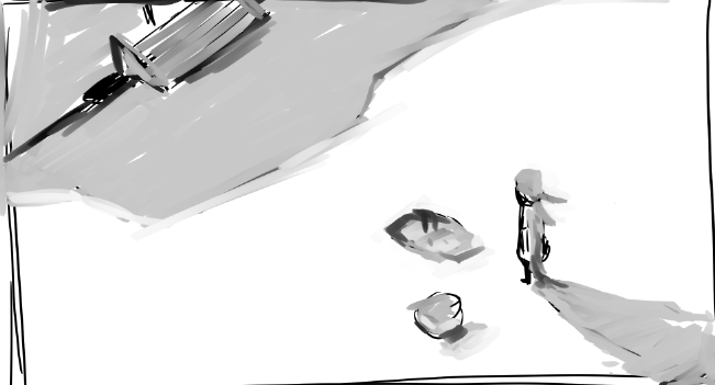
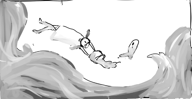
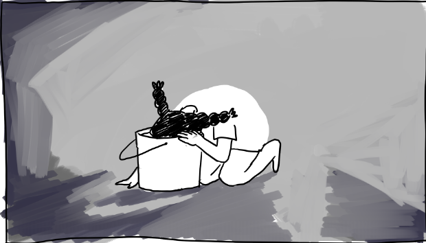
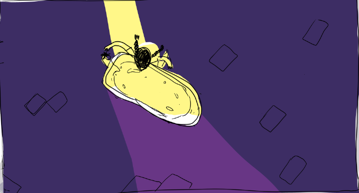
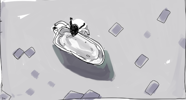
I found that when I try and rethink a specific shot that I know I would like to have in my film, I end up just redrawing the same thing but in a slightly different angle, so I tried another approach. In the shot above I wanted to portray a sense of longing for the fish, so in the shot below I just drew something that would convey that as well but may not necessarily fit the narrative.
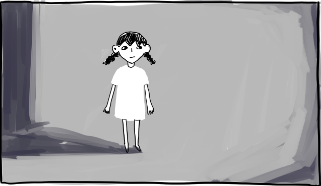
In the two pictures above I wanted to experiment with negative space for her night dress. I also used a bit of dark blue on the background. The way the colours are blended together are still quite soft, could possibly be done with charcoal.
I experimented with softer blocks of colours and sharp blocks of colour. I liked the limited palette on the first image, it conveys darkness without the image looking dull. The lighting also looks much more dramatic.
This workshop forced me to let go of my inhibitions and familiarity with my story and let my self completely rethink how I could show the events that happen within the film. After the various exercises that we did I realised that my film needs to be more fluid, in the sense that scenes could transition and morph into each other, which is something I didn’t think of much before, as I was still thinking of the film in regards to live-action conventions. The exercise where we had to draw important objects from our film in different scales and angles helped a lot in visualising a less “stiff” camera movement. That being said, I was still a little stuck when asked to reproduce some of the shots in a different, more effective way, resorting to something not much different than what I started with. However, I think this workshop helped open my eyes to what could be done within animation, which would help my film a lot.
